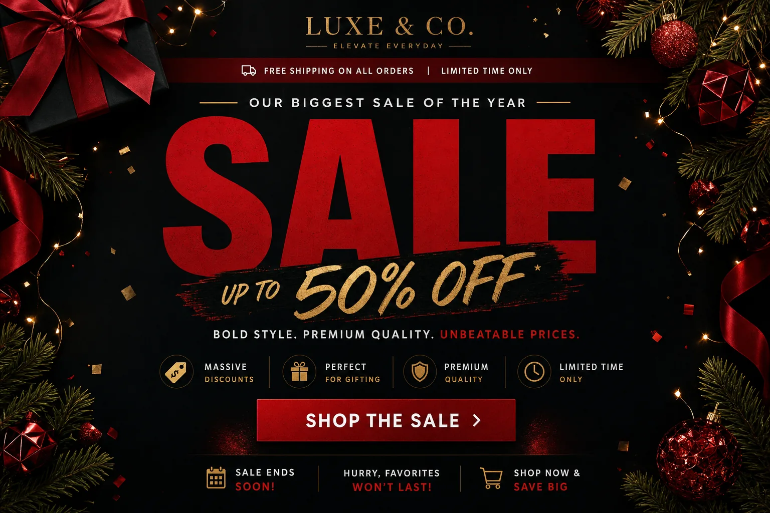
A strong black friday email template is not a single design you rush out on Thanksgiving week. For CRM, lifecycle, and email design teams, the highest-value template is a campaign system: one flexible framework that can support the full promotional arc from teaser to deal reveal, urgency, and final reminder.
That distinction matters because Black Friday email has to do several jobs at once. It must be fast to produce, easy to scan on mobile, accessible to more subscribers, accurate under deadline pressure, and clear enough to move shoppers from interest to action in seconds. A single overstuffed promo blast often tries to create anticipation, explain the offer, merchandise products, answer terms, and force urgency in one screen. The result is usually clutter.
A sequence lets each email do one job well. The teaser builds attention. The reveal makes the offer unmistakable. The urgency send helps undecided shoppers act before the deadline. The last-chance message removes ambiguity and gives subscribers a final, honest reason to click.
For JQRD’s audience of email marketers, CRM teams, lifecycle strategists, and email designers, the practical goal is simple: create a repeatable Black Friday template approach that improves production speed without sacrificing clarity, responsive behavior, accessibility, or conversion readiness.
Why Black Friday email templates need a sequence, not a single send
Black Friday campaigns fail when teams treat the email template as a container instead of a messaging plan. A template should not merely hold a hero image, discount code, and button. It should help the team decide what the subscriber needs to know at each stage of the promotion.
The most reliable sequence follows four stages:
- Teaser: Signal that something valuable is coming and create a reason to pay attention.
- Deal reveal: Announce the live offer with the clearest possible path to purchase.
- Urgency: Remind shoppers of the deadline, inventory considerations, or benefit of acting now.
- Last chance: Make the final opportunity explicit and remove any remaining confusion.
This structure aligns message intent with shopper intent. Before the sale, many subscribers are not ready to buy; they are deciding which brands deserve attention. When the sale opens, they need offer clarity and a direct click path. Near the deadline, they may need a concise reminder, not a full brand story. At the final stage, the most important information is what ends, when it ends, and what action to take.
Searchers looking for a black friday email template often want something faster than a blank-page strategy session. They need a usable structure, practical copy direction, and a design system their team can adapt quickly. Planning the sequence before production helps teams reduce errors, avoid inconsistent layouts, and move faster through creative review, stakeholder approvals, QA, and deployment.
A strong template sequence also helps protect brand consistency. If every send uses a different design language, subscribers must relearn the layout each time. If every send uses the same modular system, the campaign feels connected while each message still has a distinct purpose.
What a high-converting Black Friday email template must include
The best Black Friday templates are easy to understand under pressure. Subscribers may be checking email between meetings, while shopping on a phone, or comparing multiple brands at once. The template has to communicate the offer before the subscriber loses interest.
Start with a clear hierarchy. The hero area should answer three questions quickly: what is the offer, why does it matter, and where should the subscriber click? Avoid placing multiple competing messages in the first screen. If the offer is “30% off sitewide,” that should not be visually equal to a secondary product callout, loyalty reminder, and shipping banner.
A practical Black Friday template should include these reusable components:
- Preheader and opening message: Support the subject line with specific offer or timing context.
- Hero headline: State the primary sale message in plain language.
- Offer framing: Show the discount, promotion type, or value proposition prominently.
- Primary CTA: Use a visible button with action-oriented copy such as “Shop the Sale,” “Get Early Access,” or “Browse Deals.”
- Product or category blocks: Help subscribers move toward relevant shopping paths without overcrowding the hero.
- Terms area: Reserve space for promo codes, exclusions, expiration times, and eligibility details.
- Fallback text and alt text: Ensure the message still works if images are blocked or slow to load.
For responsive email design, plan the mobile view first. Many Black Friday emails are opened on small screens, so the layout should stack cleanly, buttons should be easy to tap, and text should remain readable without pinching or zooming. Use generous spacing around CTAs, avoid tiny legal text that becomes unreadable, and test whether the offer remains clear when images are disabled.
Accessibility should be part of the template, not a final polish step. Use sufficient color contrast for text and buttons. Avoid relying on color alone to communicate urgency or discounts. Write descriptive alt text for meaningful images, and use empty or minimal alt text for decorative elements. Keep button copy specific enough that it makes sense out of context.
Modularity is what makes the template operationally useful. Instead of rebuilding each send, create swappable blocks: hero, discount module, countdown or deadline module, category grid, product feature, loyalty/VIP banner, shipping message, social proof area, and terms block. The team can then adapt one system to many offers while keeping design and QA predictable.
Teaser email templates: build anticipation without giving away the whole offer
The teaser email has one job: make subscribers ready for the next message. It does not need to explain every detail or reveal the full discount. In many cases, giving away too much too early can reduce the reason to open the launch email. The teaser should create curiosity while still being useful.
Effective teaser subject lines often use patterns like:
- Timing cue: “Black Friday starts soon” or “Your early access window opens tomorrow.”
- VIP cue: “You’re first in line for our biggest sale.”
- Benefit cue: “Your holiday shopping shortcut is almost here.”
- Reminder cue: “Set a reminder: deals go live Friday.”
The preview text should add context rather than repeat the subject line. If the subject line says, “Black Friday starts soon,” the preview text could say, “Watch your inbox for early access and limited-time offers.” This gives the subscriber a reason to pay attention without overloading the teaser.
Template-wise, teasers work best with one-message focus. Keep navigation minimal, reduce secondary CTAs, and avoid presenting too many product blocks. The visual treatment can hint at the sale through bold typography, campaign colors, a wrapped-product concept, calendar-style design, or a simple countdown cue. The goal is anticipation, not full merchandising.
Segmentation can make teaser templates more relevant. VIP or loyalty subscribers might receive “early access opens soon” language. Recent browsers might see a category-specific teaser. Lapsed customers might receive a broader reactivation message such as “Black Friday is the best time to come back.” New subscribers may need a short trust-building line that explains what the brand is known for before the sale begins.
A teaser email should still have a CTA, but the CTA should match the stage. Options include “Set a Reminder,” “Join Early Access,” “Preview What’s Coming,” or “Save the Date.” If the promotion is not live yet, avoid CTAs that imply immediate discounts unless there is a real pre-sale or waitlist experience behind the click.
Deal reveal templates: present the offer clearly and make purchase obvious
The deal reveal is the centerpiece of the Black Friday sequence. This is where the template must prioritize clarity over cleverness. The subscriber should not have to decode the offer, hunt for the promo code, or scroll past multiple design elements to find the CTA.
For more context, Content Marketing Institute offers additional background on this topic.
Use headline formulas that make the promotion immediate:
- “Black Friday is live: 30% off sitewide.”
- “Today only: save $50 on orders over $150.”
- “Bundle more, save more this Black Friday.”
- “Early access starts now for subscribers.”
The hero area should contain the main offer, a short support line, and the primary CTA. If a promo code is required, place it near the button and make it visually distinct. If no code is needed, say so. “No code needed” removes friction and can prevent subscribers from abandoning the purchase path to search for a discount field explanation.
Different offer types require different template emphasis:
- Percentage-off offers: Make the percentage the dominant visual element and clarify scope, such as sitewide, selected categories, or specific collections.
- Dollar-off offers: Pair the savings amount with the threshold, for example “Save $25 when you spend $100.”
- Bundles: Show the bundle contents and the value comparison clearly.
- Free shipping: State whether there is a minimum order value and whether it stacks with other deals.
- Early access: Emphasize exclusivity, access window, and who qualifies.
After the hero, use category-based merchandising to help subscribers choose quickly. Instead of a long, unfocused product grid, group shopping paths by intent: “Gifts under $50,” “Best sellers,” “For first-time buyers,” “Limited-time bundles,” or “Back-in-stock favorites.” These blocks help lifecycle teams match the email to different subscriber segments while keeping the master template consistent.
Mobile scanning should guide every design decision. If the hero image contains essential offer text, include live text as well so the message remains accessible and readable. Keep button labels short. Avoid multi-column layouts that become awkward when stacked. Put the most important CTA before dense product content.
The deal reveal template should also leave room for one or two future internal links, such as links to a responsive email design guide, an email accessibility checklist, or a Black Friday QA workflow. Those resources can support production teams without distracting from the main conversion path.
Urgency and last-chance templates: increase action without sounding spammy
Urgency emails work when they are specific, accurate, and useful. They fail when they rely on vague pressure. “Hurry!” is less persuasive than “Ends tonight at 11:59 PM” because the latter gives the subscriber concrete information. The template should make the deadline visible, the benefit clear, and the CTA immediate.
This is the natural point in the article to add an authoritative citation later about consumer response, urgency, email engagement, or promotional timing. The key practical principle is to use urgency responsibly: do not invent scarcity, reset countdowns without explanation, or imply a deadline that is not real.
Urgency templates can focus on several legitimate triggers:
- Deadline reminders: “Black Friday pricing ends tonight.”
- Stock cues: “Popular sizes are moving fast” or “Limited quantities remain,” when accurate.
- Cart recovery: “Your cart is still eligible for the Black Friday offer.”
- Shipping timing: “Order by tonight to use this deal before the holiday rush.”
- Category reminders: “Last chance for deals on best sellers.”
The urgency template should be shorter than the reveal template. At this stage, subscribers have likely seen the offer already. Repeating the full campaign story can dilute the deadline. A strong urgency email might include a compact hero, visible expiration time, one primary CTA, and a small set of relevant products or categories.
Last-chance emails should be even more direct. Use clear language such as “Final hours,” “Ends tonight,” or “Last chance to save.” Avoid stacking too many urgency phrases together, which can make the email feel generic or aggressive. One strong deadline statement supported by specific details is usually more effective than five alarm-style lines.
For cart and browse recovery, align the template with behavior. If someone left products in cart, lead with the cart context and remind them the promotion applies if accurate. If someone browsed a category, use the category as the hook. If someone has not engaged with the campaign, a broad final reminder may be more appropriate than a personalized recovery message.
Template rule: urgency should clarify a real decision point. If the email does not help the subscriber understand what changes after the deadline, the urgency is probably too vague.
How to adapt one Black Friday email template into a full campaign system
The most efficient teams do not design every Black Friday email from scratch. They create a master template with modular blocks, then adapt the modules to each stage of the promotional lifecycle. This gives marketers flexibility and gives designers and developers a stable framework to test.
Build the system around a shared content checklist:
- Campaign stage: teaser, reveal, urgency, or last chance.
- Primary audience: full list, VIP, recent purchasers, lapsed customers, cart abandoners, or category browsers.
- Main message: one sentence that defines what the email must communicate.
- Offer details: discount, code, eligibility, exclusions, deadline, and time zone.
- Primary CTA: destination URL and button copy.
- Secondary modules: categories, products, shipping note, loyalty note, or terms.
- Personalization rules: dynamic content, segmentation logic, or fallback copy.
Before launch, run a structured QA process. Check every link, including logo, hero, buttons, product modules, legal links, and tracking parameters. Test rendering across major inbox environments and device sizes. Confirm that dark mode does not make text or buttons unreadable. Review image weights so the email loads quickly. Validate alt text, color contrast, button size, and readable font sizing.
Measurement should be planned before the campaign goes live. Define what success means for each stage. Teasers may be evaluated by open rate, click interest, reminder signups, or early access registrations. Reveal emails may focus on clicks, revenue, conversion rate, and product/category engagement. Urgency and last-chance emails may be assessed by incremental revenue, cart recovery, deadline-period conversion, and unsubscribe or complaint impact.
Use consistent naming conventions for campaigns, audiences, modules, and links. This makes post-campaign analysis far easier. If every CTA is labeled generically, the team will struggle to understand which module performed. If links are named by stage and block, the analysis can reveal whether the hero CTA, category grid, product module, or deadline banner drove meaningful engagement.
After the campaign, review both performance and production quality. Which subject line patterns drove qualified clicks? Which template modules created friction in QA? Which mobile layouts were easiest to scan? Which segments responded to early access, category merchandising, or final reminders? Document these findings while the details are fresh so next year’s Black Friday template starts from evidence, not memory.
A practical Black Friday email system should help teams move faster from teaser to final sale while keeping the subscriber experience clear. When the template supports the full lifecycle, every send has a purpose, every module has a job, and every CTA is easier for the subscriber to act on.